
SEASON 23 EPISODE 8
MONUMENTAL LIVING IN GREEN SHADES
Jan Willem and Debbie live with their daughters Iza and Maevi in a historic family home in Naaldwijk. Six years ago, they took over Jan Willem’s childhood home. Despite their efforts to renovate it, the house still doesn’t feel like a warm, cohesive whole.
Jan Willem loves bold statements and lots of art, while Debbie seeks calm and warmth. Because of their differing tastes and the many separate rooms, the house lacks unity.
Want to know how stylist Frans connects these contrasts into one stylish whole? Discover the color palette that finally makes the house truly their home.
LAB colors
IN THIS EPISODE

HOTEL BLEND
Stylist Frans chooses to give each room its own color theme. He combines blue with a light green tint – Jan Willem’s favorite – with the warm green that Debbie loves so much. The makeover is therefore named ‘Hotel Blend’.
The green palette consists of the LAB colors Moss no. 41, Army Green no. 211, and Smoking Grass no. 23.


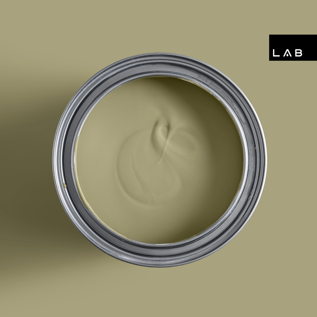
SOFT AS MOSS
The walls in the dining room and conservatory are painted in the soft green LAB color Moss no. 41. This moss green instantly creates an oasis of calm – exactly what Debbie desires. Thanks to the subtle yellow undertone, the color effortlessly combines with other warm colors, especially yellows.
In this home, Moss no. 41 is paired with a blue accent, making the palette perfectly suited to Jan Willem’s distinctive taste.

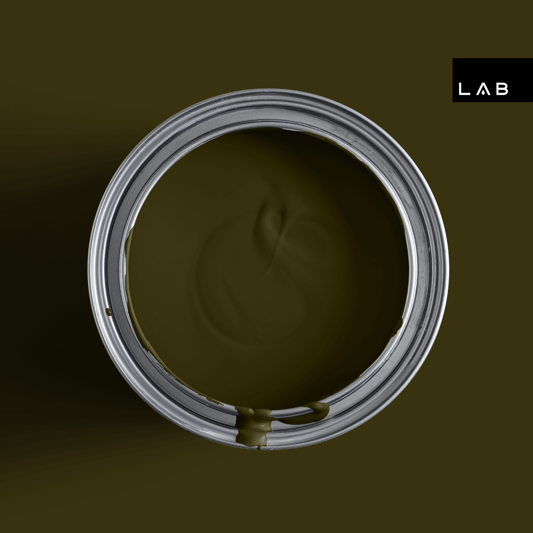
STATEMENT
The window frames are all painted in Army Green no. 211. This intense, dark green LAB color is perfect for a bold statement. Combined with Moss no. 41, it creates a tone-on-tone effect that radiates calm and luxury. Dark frames also provide contrast and depth, instantly giving the space a hotel-chic look.


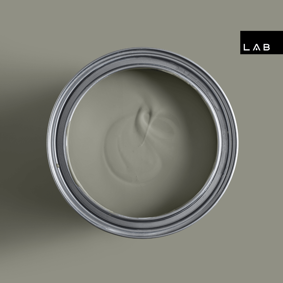
TOUCH OF BLUE
Green remains the foundation of the palette, but in the living room, blue makes a subtle entrance.
The choice is Smoking Grass no. 23: a muted, calming shade that immediately brings relaxation – exactly what the residents are looking for. Thanks to the subtle blue glow and the gray undertone, this color effortlessly blends with various styles.

MUSEUM-QUALITY
Art plays a major role in the lives of the residents and therefore holds a prominent place in the home. Thanks to the combination of various materials and natural tones, the art seamlessly matches the color palette and enhances the atmosphere of the historic building.

WORD IN LOVE WITH YOUR HOME AGAIN
Do you want to fall in love with your home all over again, just like the residents in this episode? Our color consultants are happy to help you.


