

SEASON 23 EPISODE 7
A WARM HOME FULL OF SAND TONES
Nancy and Lars live with their daughters Riva and Mint in a newly built house in Honselersdijk. During the move, Nancy was pregnant, which led them to choose safe, neutral options. Now, nine years later, the house feels neat but impersonal.
Lars loves dark, sturdy materials and rich colors, while Nancy dreams of light, calm, and a touch of Japandi with character. Their different tastes resulted in compromises that never felt quite finished. The space is large and bright but lacks warmth and coziness.
Want to know how Marianne combined both living preferences into one atmospheric whole? Discover the color palette she used here.
LAB colors
IN THIS EPISODE


BEACH HOUSE
What was once a functional but impersonal home now gains more warmth and character. Marianne beautifully combines the soft sand and beach feeling with the heavier, rustic atmosphere Lars was looking for. She calls the new style ‘Beachy Country House’.
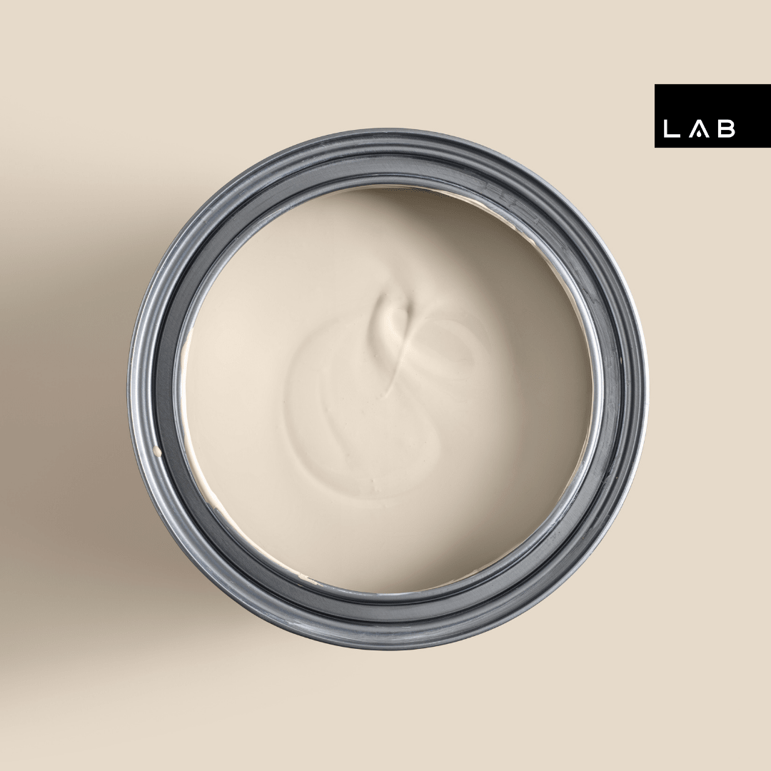
The color palette consists of the calm base tone Ibiza Rush no. 966, complemented by the warmer sand color Sensational Sand no. 290 and a subtle accent in Oyster Crush no. 581.


TINTED FOUNDATION BASE
As a base, Marianne chooses the soft sandy shade Ibiza Rush no. 966. This shade breathes Mediterranean warmth and fits perfectly in a natural boho interior. Moreover, the color combines beautifully with other warm earth tones.

SOFT CONNECTION
For the true sand feeling, the long wall that connects the dining area and seating area is painted in the color Sensational Sand no. 290. The warm shade adds a touch of elegance and perfectly matches the rustic, slightly heavier atmosphere that Lars likes to see. This creates a beautiful connection between the mood boards of both residents.


TOUCH OF TRAVERTINE
The kitchen is still in good condition but lacks the warmth and atmosphere that Nancy and Lars desire. By adding travertine tiles, the space gains more character and vibrancy. This natural stone also beautifully complements Marianne's chosen color palette, where soft sand tones take center stage.

Color Crush
At the front of the house, facing south, there is a bay window that until now felt like wasted space to the residents. Marianne comes up with a clever solution: an extra seating area with integrated storage. She has it finished in the color Oyster Crush no. 581. The result is a stylish eye-catcher that gives the house even more character.

WORD IN LOVE WITH YOUR HOME AGAIN
Do you want to fall in love with your home all over again, just like the residents in this episode? Our color consultants are happy to help you.


